

Key Takeaways
- Most design terms describe techniques, not expensive products, so understanding them saves money.
- An accent wall uses one painted or papered surface to anchor a room's color story.
- A vignette is a small, intentional grouping of objects that gives a surface visual purpose.
- Negative space is the empty area around objects; leaving some deliberately makes a room feel larger.
- Scale and proportion describe how object sizes relate to each other and the room itself.
- A capsule approach to decor means buying fewer, more versatile pieces rather than filling every corner.
Budget decorating terminology
Budget decorating terminology refers to the set of words and phrases that interior designers and home stylists use to describe visual techniques, furniture arrangements, and color strategies. Understanding this vocabulary helps homeowners plan purchases and layouts without hiring a professional. Many of these concepts cost little or nothing to apply once you know what they mean.
Some terms, such as 'color drenching' or 'biophilic design,' come from professional design theory but translate directly into low-cost DIY decisions about paint and plant placement.
Why the vocabulary matters before you spend anything
Decorating guides and social media posts throw around words like 'layering,' 'focal point,' and 'visual weight' without explaining what they mean. When a term stays fuzzy, shoppers tend to overbuy, grabbing extra pieces hoping something will click. Clarifying the terminology first is one of the cheaper things you can do before a single dollar leaves your wallet.
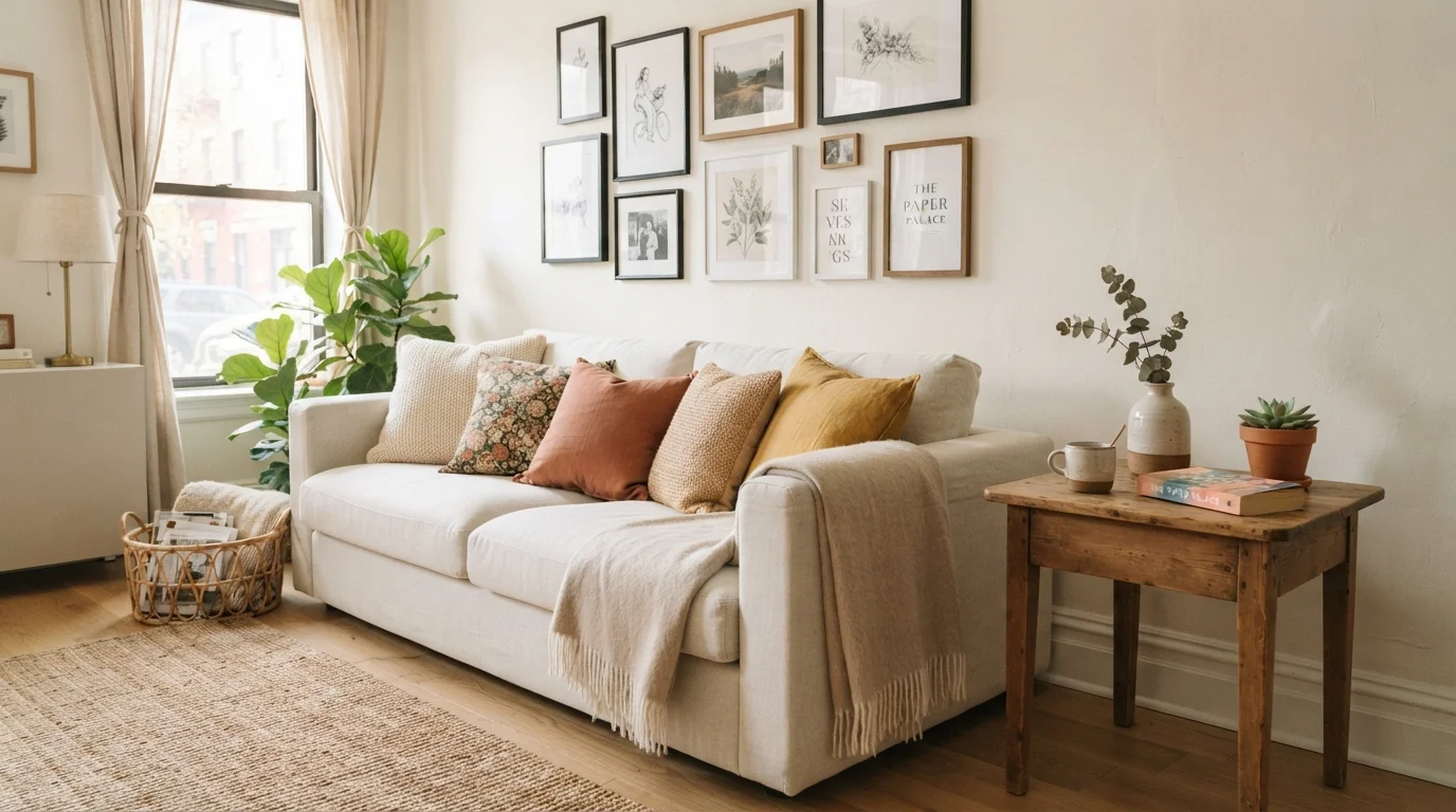
Consider the word 'layering.' In a decor context, it means placing objects or textiles at different depths and heights so the eye moves through the room rather than stopping at one flat surface. A layered look on a sofa might mean a larger solid throw behind two patterned pillows, with a smaller lumbar pillow in front. You are not buying more; you are placing what you have with more intention. That distinction is worth understanding before you go shopping for 'more pillows.'
Before you rearrange or repurchase anything, the room assessment checklist can help you identify what you already own that can be repositioned rather than replaced.
Core terms decoded
Focal point: The feature a room is arranged around, such as a fireplace, large window, or piece of artwork. Every other element in the room should support, not compete with, this anchor. If a room has no natural focal point, you can create one with a large mirror, a gallery wall, or an accent wall. The cost involved is mainly in choosing where to direct attention, not in buying something new.
Accent wall: One surface treated differently from the others, usually with paint, wallpaper, or wood paneling. It costs far less than repainting an entire room and can shift the perception of a space's proportions significantly. A dark color on the wall opposite a window, for instance, makes that wall appear to recede.
Vignette: A small, curated grouping of objects on a surface, like a shelf, console table, or windowsill. A workable formula is one tall item (a vase or lamp), one mid-height item (a small stack of books), and one small accent (a candle or dish). The goal is for the grouping to look deliberate rather than accumulated.
Negative space: The empty, undecorated areas around objects. Leaving negative space is not laziness; it lets the eye rest and makes the objects you do display read more clearly. Overcrowded surfaces are one of the most common visual problems in budget-decorated homes.
Scale and proportion: Scale describes how big an object is relative to the room. Proportion describes how objects relate in size to each other. A classic scale mistake is a small rug under a large sectional, which makes the seating float rather than feel anchored. Getting scale right costs nothing but attention, and it prevents expensive do-overs.
Color story: The two or three hues repeated across different elements in a room so it reads as intentional. A color story does not mean everything matches; it means a color from the rug appears again in a pillow or a print on the wall. Repetition is what creates cohesion.
Start with a color story audit
Before buying anything, identify the two or three colors already present in your room through existing furniture, textiles, or artwork. Write them down. Any new purchase should repeat at least one of those colors. This single habit prevents the scattered, unconnected look that comes from impulse buying and saves money by narrowing your options before you shop.
Terms that relate to shopping and planning
Capsule approach: Borrowed from the fashion concept of a capsule wardrobe, this means building a room around a small number of versatile, well-chosen pieces rather than filling every surface. In practice, a capsule living room might have one sofa, one rug, one coffee table, and two accent chairs, with accessories added deliberately. Fewer items at better quality often performs better visually than many cheaper pieces. The real cost of cheap decor explains why quantity rarely beats quality in the long run.
Visual weight: How heavy or dominant an object appears, based on its color, size, texture, and pattern, rather than its actual mass. A dark sofa has more visual weight than a light one. Distributing visual weight evenly across a room keeps it from feeling lopsided. You can add visual weight cheaply with a dark throw or a bold print, and reduce it by switching to a lighter cover.
Traffic flow: The path people naturally walk through a room. Furniture arrangement should allow at least 30 to 36 inches of clearance in main pathways. Blocking traffic flow makes rooms feel cramped regardless of size or decor quality. This costs nothing to fix by repositioning what you have, which is one reason small furniture moves can change how a room feels entirely.
Many of the assumptions families make about what decorating requires are worth re-examining. Decorating myths about matching sets and expensive materials often push families toward spending that does not improve the result.
Putting the vocabulary to practical use
Knowing these terms changes how you approach a room. Instead of buying more, you can ask: does this room lack a focal point, or is the focal point competing with too many other objects? Is the scale of the rug correct for the furniture grouping? Does the color story repeat across at least three elements?
These are diagnostic questions, not shopping prompts. Most rooms that feel 'off' have a terminology problem rather than a budget problem. A room with the wrong-scale rug, no clear focal point, and cluttered surfaces will not improve by adding more items. It will improve when those structural issues are addressed first, often for little or no cost.
For a room-by-room application of these concepts, the starter framework for first-time decorators walks through how to apply these principles practically, space by space.